
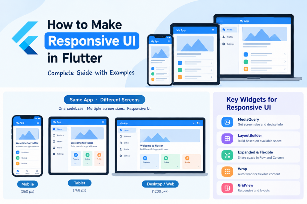
How to Make Responsive UI in Flutter- Have you ever created a Flutter screen that looks perfect on your phone but breaks on a tablet, desktop, or Flutter web browser? This usually happens when the UI uses fixed widths, fixed heights, or layouts that do not account for the available screen space.
In this tutorial, you will learn how to make responsive UI in Flutter using practical examples. We will cover MediaQuery, LayoutBuilder, Expanded, Flexible, Wrap, responsive grids, screen-size breakpoints, and adaptive navigation.
By the end, you will be able to build Flutter interfaces that work across small phones, large phones, tablets, and desktop or web layouts without maintaining completely separate applications.
What Is Responsive UI in Flutter?
Responsive UI is a design approach in which your application’s layout adjusts to the available screen space. Instead of forcing every device to display the same layout, you make the interface flexible enough to fit different window sizes.
For example:
- On a small mobile screen, product cards may appear in one column.
- On a larger phone, they may appear in two columns.
- On a tablet or desktop, the same cards may appear in three or four columns.
- Navigation may change from a bottom navigation bar to a sidebar on wider screens.
Flutter supports responsive and adaptive interfaces through built-in widgets and layout tools. Responsive design focuses on fitting the content into the available space, while adaptive design also considers which layout or interaction pattern is most suitable for that space.
Official documentation: Adaptive and responsive design in Flutter.
1. Avoid Fixed Widths and Heights
One of the most common mistakes beginners make is assigning fixed dimensions to almost every widget.
Consider this example:
Container(
  width: 350,
  height: 200,
  child: const Text('Welcome to Flutter'),
)
This might look fine on a particular phone, but a width of 350 logical pixels may not fit inside a narrow window or a container with limited space.
Instead, use flexible constraints and responsive layout widgets.
For example:
Container(
  width: double.infinity,
  constraints: const BoxConstraints(
    maxWidth: 600,
    minHeight: 150,
  ),
  padding: const EdgeInsets.all(20),
  child: const Text(
    'Welcome to Flutter',
    style: TextStyle(fontSize: 20),
  ),
)
Here, double.infinity requests the maximum available width allowed by the parent, while maxWidth prevents the container from becoming excessively wide.
Important: double.infinity does not mean that a widget can ignore its parent’s constraints. The parent must provide a valid layout constraint.
2. Use MediaQuery to Get the Available Screen Size
MediaQuery helps you access information about the current app window, including its width, height, text scaling, and system padding.
For responsive layouts, use MediaQuery.sizeOf(context) when you need the overall app-window dimensions.
Example: Adjust a Container’s Width
import 'package:flutter/material.dart';

class ResponsiveBox extends StatelessWidget {
  const ResponsiveBox({super.key});

  @override
  Widget build(BuildContext context) {
    final screenWidth = MediaQuery.sizeOf(context).width;

    final boxWidth = screenWidth < 600
        ? screenWidth * 0.9
        : screenWidth < 1024
            ? screenWidth * 0.7
            : 800.0;

    return Scaffold(
      appBar: AppBar(
        title: const Text('Responsive UI'),
      ),
      body: Center(
        child: Container(
          width: boxWidth,
          padding: const EdgeInsets.all(20),
          color: Colors.blue.shade100,
          child: const Text(
            'This container adjusts to the available screen width.',
          ),
        ),
      ),
    );
  }
}
How does this work?
- Below 600 logical pixels, the container uses 90% of the available width.
- From 600 to below 1024 logical pixels, it uses 70%.
- At 1024 logical pixels and above, it uses a maximum width of 800 logical pixels.
These are example thresholds, not mandatory Flutter rules. Choose breakpoints based on when your actual content needs to change.
Use MediaQuery.sizeOf(context) for app-window-level decisions. When designing a widget inside a smaller panel, dialog, or split layout, LayoutBuilder is often a better choice.
3. Use LayoutBuilder for Responsive Layouts
LayoutBuilder is one of the most useful widgets for responsive Flutter development. It gives you the constraints supplied by the widget’s parent, allowing you to build a layout based on the space actually available to that section.
For example, a Flutter application might run in a wide browser window while its main content occupies only half of the screen. Using the full window width could produce the wrong layout decision. LayoutBuilder helps solve this problem.
Basic LayoutBuilder Example
LayoutBuilder(
  builder: (context, constraints) {
    if (constraints.maxWidth < 600) {
      return const Text('Mobile layout');
    } else {
      return const Text('Wide layout');
    }
  },
)
The constraints.maxWidth value tells you the maximum width available to the widget.
Responsive Row and Column Example
Suppose you have an image and some descriptive text. On a phone, they should appear vertically. On a tablet or desktop, they can appear side by side.
import 'package:flutter/material.dart';

class ResponsiveContent extends StatelessWidget {
  const ResponsiveContent({super.key});

  @override
  Widget build(BuildContext context) {
    return LayoutBuilder(
      builder: (context, constraints) {
        final isWide = constraints.maxWidth >= 600;

        final image = Container(
          height: 180,
          width: isWide ? 220 : double.infinity,
          color: Colors.blue.shade100,
          alignment: Alignment.center,
          child: const Icon(
            Icons.devices,
            size: 60,
          ),
        );

        final description = const Padding(
          padding: EdgeInsets.all(16),
          child: Text(
            'Build responsive applications with Flutter. '
            'Adapt your layout to phones, tablets, and desktop windows.',
            style: TextStyle(fontSize: 16),
          ),
        );

        return isWide
            ? Row(
                crossAxisAlignment: CrossAxisAlignment.start,
                children: [
                  image,
                  Expanded(child: description),
                ],
              )
            : Column(
                crossAxisAlignment: CrossAxisAlignment.stretch,
                children: [
                  image,
                  description,
                ],
              );
      },
    );
  }
}
This example changes the layout direction based on available width rather than checking whether the device is specifically a phone or tablet.
When should you use LayoutBuilder?
Use it for responsive cards, dashboards, forms, product details, navigation layouts, and any widget whose appearance depends on the space allocated by its parent.
Official reference: LayoutBuilder API.
4. Understand Responsive Breakpoints in Flutter
A breakpoint is a width threshold at which your UI changes its layout.
For example, you might display a single-column layout on narrow screens and a two-column layout on wider screens.
Here is one possible breakpoint strategy:
| Available width | Example layout |
|---|---|
| Below 600 logical pixels | Compact, usually single-column layout |
| 600–1023 logical pixels | Wider content or two-column layout |
| 1024 logical pixels and above | Multi-column layout or sidebar navigation |
These values are starting points, not fixed requirements. A simple form may work at a wider width than a complex dashboard. Test the content and choose thresholds accordingly.
You can define reusable breakpoint constants:
class AppBreakpoints {
  static const double mobile = 600;
  static const double tablet = 1024;
}
Then use them in your layout:
LayoutBuilder(
  builder: (context, constraints) {
    final width = constraints.maxWidth;

    if (width < AppBreakpoints.mobile) {
      return const MobileView();
    } else if (width < AppBreakpoints.tablet) {
      return const TabletView();
    } else {
      return const DesktopView();
    }
  },
)
In this example, MobileView, TabletView, and DesktopView represent widgets you would define in your project.
For larger applications, keep breakpoint values in one place rather than scattering different width thresholds throughout your codebase.
5. Use Expanded and Flexible in Row and Column
Expanded and Flexible help children share the available space inside a Row or Column.
Without them, a row containing several large widgets can overflow horizontally.
Incorrect approach
Row(
  children: [
    Container(width: 250, height: 100),
    Container(width: 250, height: 100),
  ],
)
This row requires at least 500 logical pixels of width, before accounting for any spacing or padding. It may overflow in a narrow layout.
Better approach
Row(
  children: [
    Expanded(
      child: Container(
        height: 100,
        color: Colors.blue,
      ),
    ),
    const SizedBox(width: 12),
    Expanded(
      child: Container(
        height: 100,
        color: Colors.green,
      ),
    ),
  ],
)
The two containers share the remaining available width.
Use Expanded when a child should fill its share of the available space. Use Flexible when a child may take less than its allocated share.
However, Expanded is not a universal fix. A row with too many children may still be unsuitable for a narrow screen. In such cases, switch to a Column, use a Wrap, or show fewer items per row.
6. Use Wrap Instead of Row for Flexible Content
Wrap places children horizontally until they no longer fit, then moves the remaining children to another line.
This makes it useful for category chips, filters, tags, and small action buttons.
Wrap(
  spacing: 8,
  runSpacing: 8,
  children: [
    Chip(label: const Text('Flutter')),
    Chip(label: const Text('Dart')),
    Chip(label: const Text('Firebase')),
    Chip(label: const Text('Android')),
    Chip(label: const Text('UI Design')),
  ],
)
Unlike Row, Wrap can create multiple runs of children. You do not need to manually calculate the number of chips that fit on a line.
For interactive filters, you can use FilterChip or ChoiceChip with their selection callbacks.
7. Build a Responsive GridView
A grid is useful for product listings, dashboards, portfolios, and category screens. Instead of manually setting the number of columns for every screen size, you can calculate it from the available width.
Example: Responsive Card Grid
import 'package:flutter/material.dart';

class ResponsiveGrid extends StatelessWidget {
  const ResponsiveGrid({super.key});

  @override
  Widget build(BuildContext context) {
    return LayoutBuilder(
      builder: (context, constraints) {
        const minCardWidth = 220.0;
        const spacing = 16.0;

        final availableWidth = constraints.maxWidth;

        final columns = ((availableWidth + spacing) /
                (minCardWidth + spacing))
            .floor()
            .clamp(1, 4);

        return GridView.builder(
          padding: const EdgeInsets.all(16),
          itemCount: 12,
          gridDelegate:
              SliverGridDelegateWithFixedCrossAxisCount(
            crossAxisCount: columns,
            crossAxisSpacing: spacing,
            mainAxisSpacing: spacing,
            childAspectRatio: 1.1,
          ),
          itemBuilder: (context, index) {
            return Card(
              child: Padding(
                padding: const EdgeInsets.all(16),
                child: Column(
                  mainAxisAlignment: MainAxisAlignment.center,
                  children: [
                    const Icon(
                      Icons.widgets_outlined,
                      size: 36,
                    ),
                    const SizedBox(height: 12),
                    Text(
                      'Item ${index + 1}',
                      style: const TextStyle(
                        fontSize: 16,
                        fontWeight: FontWeight.bold,
                      ),
                    ),
                  ],
                ),
              ),
            );
          },
        );
      },
    );
  }
}
What does this code do?
LayoutBuildermeasures the width available to the grid.- The calculation estimates how many cards can fit, using a minimum desired card width of 220 logical pixels.
clamp(1, 4)keeps the column count between one and four.GridView.buildercreates the cards as needed for the scrollable grid.- Spacing is applied between rows and columns.
The childAspectRatio controls each grid item’s width-to-height ratio. Adjust it to suit the actual card content.
This approach is particularly useful for Flutter web dashboards, ecommerce screens, and applications with many reusable cards.
8. Create a Responsive Navigation Layout
Navigation is another important part of responsive design. A bottom navigation bar may work well on a phone, while a navigation rail or sidebar may use the space better on a larger window.
Here is a simple example using NavigationBar on narrow screens and NavigationRail on wider screens.
import 'package:flutter/material.dart';

class ResponsiveNavigationPage extends StatefulWidget {
  const ResponsiveNavigationPage({super.key});

  @override
  State<ResponsiveNavigationPage> createState() =>
      _ResponsiveNavigationPageState();
}

class _ResponsiveNavigationPageState
    extends State<ResponsiveNavigationPage> {
  int selectedIndex = 0;

  final pages = const [
    Center(child: Text('Home Page')),
    Center(child: Text('Search Page')),
    Center(child: Text('Profile Page')),
  ];

  @override
  Widget build(BuildContext context) {
    return LayoutBuilder(
      builder: (context, constraints) {
        final isWide = constraints.maxWidth >= 600;

        return Scaffold(
          body: SafeArea(
            child: Row(
              children: [
                if (isWide)
                  NavigationRail(
                    selectedIndex: selectedIndex,
                    onDestinationSelected: (index) {
                      setState(() => selectedIndex = index);
                    },
                    labelType: NavigationRailLabelType.all,
                    destinations: const [
                      NavigationRailDestination(
                        icon: Icon(Icons.home_outlined),
                        label: Text('Home'),
                      ),
                      NavigationRailDestination(
                        icon: Icon(Icons.search),
                        label: Text('Search'),
                      ),
                      NavigationRailDestination(
                        icon: Icon(Icons.person_outline),
                        label: Text('Profile'),
                      ),
                    ],
                  ),
                Expanded(
                  child: pages[selectedIndex],
                ),
              ],
            ),
          ),
          bottomNavigationBar: isWide
              ? null
              : NavigationBar(
                  selectedIndex: selectedIndex,
                  onDestinationSelected: (index) {
                    setState(() => selectedIndex = index);
                  },
                  destinations: const [
                    NavigationDestination(
                      icon: Icon(Icons.home_outlined),
                      label: 'Home',
                    ),
                    NavigationDestination(
                      icon: Icon(Icons.search),
                      label: 'Search',
                    ),
                    NavigationDestination(
                      icon: Icon(Icons.person_outline),
                      label: 'Profile',
                    ),
                  ],
                ),
        );
      },
    );
  }
}
This example demonstrates the navigation switch. The page widgets are placeholders; replace them with your real screens.
Notice that Expanded allows the selected page to occupy the remaining width. The same navigation selection is used for both layouts.
For a production app, you should also consider navigation state, routing, keyboard focus, accessibility, and whether a rail or a full sidebar suits the content.
9. Make Text and Spacing Responsive
Responsive design is not just about changing the number of columns. Text, margins, and spacing must also work at different sizes.
Avoid shrinking all text indiscriminately just because the screen is small. Prefer readable typography and allow text to wrap naturally.
For example:
LayoutBuilder(
  builder: (context, constraints) {
    final horizontalPadding =
        constraints.maxWidth < 600 ? 16.0 : 32.0;

    final titleSize =
        constraints.maxWidth < 600 ? 24.0 : 32.0;

    return Padding(
      padding: EdgeInsets.symmetric(
        horizontal: horizontalPadding,
        vertical: 20,
      ),
      child: Text(
        'Build Better Flutter Applications',
        style: TextStyle(
          fontSize: titleSize,
          fontWeight: FontWeight.bold,
        ),
      ),
    );
  },
)
Use maxLines and TextOverflow.ellipsis when you intentionally need to limit text, such as in compact cards. Do not apply them everywhere, because important information may become hidden.
Also test your application with larger system font settings. Users should be able to increase text size without breaking the interface.
10. Use SafeArea to Prevent Content from Being Cut Off
Modern devices may have camera cutouts, rounded corners, and system UI areas that cover parts of the screen.
The SafeArea widget helps keep important content away from those areas.
Scaffold(
  body: SafeArea(
    child: Padding(
      padding: const EdgeInsets.all(16),
      child: Column(
        children: const [
          Text('Responsive Flutter Screen'),
          SizedBox(height: 20),
          Expanded(
            child: Center(
              child: Text('Main content'),
            ),
          ),
        ],
      ),
    ),
  ),
)
SafeArea is especially useful for screens with custom headers, full-screen layouts, and content positioned close to screen edges. It is not a substitute for responsive sizing, but it prevents a different category of layout problem.
Official reference: SafeArea and MediaQuery.
11. Complete Example: Responsive Dashboard in Flutter
Now let’s combine several concepts into a single runnable example. This dashboard uses:
- A compact header on smaller screens.
- A centered content area with a maximum width.
- One or more grid columns based on available width.
- Flexible card layouts.
- A layout that responds when the window is resized.
Create a Flutter project if you do not already have one:
flutter create responsive_ui_demo
cd responsive_ui_demo
Replace the code in lib/main.dart with the following:
import 'package:flutter/material.dart';

void main() {
  runApp(const ResponsiveApp());
}

class ResponsiveApp extends StatelessWidget {
  const ResponsiveApp({super.key});

  @override
  Widget build(BuildContext context) {
    return MaterialApp(
      title: 'Responsive Dashboard',
      debugShowCheckedModeBanner: false,
      theme: ThemeData(
        colorSchemeSeed: Colors.blue,
        useMaterial3: true,
      ),
      home: const DashboardPage(),
    );
  }
}

class DashboardPage extends StatelessWidget {
  const DashboardPage({super.key});

  final List<String> titles = const [
    'Projects',
    'Tasks',
    'Messages',
    'Reports',
    'Team',
    'Settings',
  ];

  final List<IconData> icons = const [
    Icons.folder_outlined,
    Icons.check_circle_outline,
    Icons.message_outlined,
    Icons.bar_chart_outlined,
    Icons.people_outline,
    Icons.settings_outlined,
  ];

  @override
  Widget build(BuildContext context) {
    return Scaffold(
      appBar: AppBar(
        title: const Text('My Dashboard'),
      ),
      body: SafeArea(
        child: LayoutBuilder(
          builder: (context, constraints) {
            final width = constraints.maxWidth;

            final columns = width < 600
                ? 1
                : width < 1000
                    ? 2
                    : 3;

            return Center(
              child: ConstrainedBox(
                constraints: const BoxConstraints(
                  maxWidth: 1200,
                ),
                child: Padding(
                  padding: EdgeInsets.all(
                    width < 600 ? 12 : 24,
                  ),
                  child: Column(
                    crossAxisAlignment:
                        CrossAxisAlignment.start,
                    children: [
                      Text(
                        'Welcome back!',
                        style: Theme.of(context)
                            .textTheme
                            .headlineMedium,
                      ),
                      const SizedBox(height: 8),
                      const Text(
                        'Manage your work from one place.',
                      ),
                      const SizedBox(height: 24),
                      Expanded(
                        child: GridView.builder(
                          itemCount: titles.length,
                          gridDelegate:
                              SliverGridDelegateWithFixedCrossAxisCount(
                            crossAxisCount: columns,
                            crossAxisSpacing: 16,
                            mainAxisSpacing: 16,
                            childAspectRatio:
                                width < 600 ? 2.4 : 1.5,
                          ),
                          itemBuilder: (context, index) {
                            return Card(
                              clipBehavior: Clip.antiAlias,
                              child: InkWell(
                                onTap: () {
                                  ScaffoldMessenger.of(
                                    context,
                                  ).showSnackBar(
                                    SnackBar(
                                      content: Text(
                                        '${titles[index]} selected',
                                      ),
                                    ),
                                  );
                                },
                                child: Padding(
                                  padding: const EdgeInsets.all(
                                    16,
                                  ),
                                  child: Row(
                                    children: [
                                      Icon(
                                        icons[index],
                                        size: 32,
                                      ),
                                      const SizedBox(width: 16),
                                      Expanded(
                                        child: Text(
                                          titles[index],
                                          style: Theme.of(
                                            context,
                                          ).textTheme.titleMedium,
                                        ),
                                      ),
                                      const Icon(
                                        Icons.arrow_forward_ios,
                                        size: 16,
                                      ),
                                    ],
                                  ),
                                ),
                              ),
                            );
                          },
                        ),
                      ),
                    ],
                  ),
                ),
              ),
            );
          },
        ),
      ),
    );
  }
}
Run the application:
flutter runTo test it in a browser, use:
flutter run -d chromeWhy is this dashboard responsive?
First, it measures available width. The LayoutBuilder reads the constraints given to the dashboard’s body.
Second, it changes the column count. Narrow layouts use one column, medium layouts use two, and wider layouts use three.
Third, it limits the content width. ConstrainedBox prevents the dashboard from stretching across an excessively wide desktop window.
Fourth, it makes the grid scrollable. GridView.builder works inside Expanded, so the grid occupies the available vertical space and can scroll when needed.
Finally, it adjusts spacing and card proportions. The layout uses different padding and aspect ratios at different widths.
These breakpoints are illustrative. Test the dashboard at intermediate widths and adjust them if the cards become cramped or leave too much empty space.
12. How to Test Responsive UI in Flutter
Do not test only on your primary development device. A responsive interface should be checked at several window sizes.
Here is a practical testing checklist:
- Test a narrow phone-sized viewport.
- Test a larger phone and both portrait and landscape orientations.
- Test a tablet-sized viewport.
- Test a desktop or browser window.
- Resize the browser gradually instead of testing only full-screen mode.
- Check for
RenderFlex overflowederrors. - Test long titles, translated text, and larger accessibility text settings.
- Check keyboard navigation and mouse interactions on desktop and web.
- Verify that buttons, dialogs, forms, and navigation remain usable.
You can use Flutter DevTools and the browser’s responsive viewport controls to inspect layout problems. Physical devices are also useful because they reveal real system insets, font rendering, and touch-target issues.
13. Common Responsive UI Mistakes to Avoid
Using device type instead of available width
Avoid assuming that every tablet needs the same layout or that every phone has the same width. A resizable desktop window or split-screen app can have less available space than a typical phone.
Prefer LayoutBuilder or MediaQuery.sizeOf(context) to measure the relevant space.
Using fixed widths everywhere
Fixed widths can create overflow when the parent becomes smaller. Prefer flexible constraints, Expanded, Flexible, or width limits where appropriate.
Putting too many widgets inside a Row
A Row does not automatically wrap its children. Use Wrap, change to a Column, or switch to a different layout when horizontal space is insufficient.
Making desktop content excessively wide
A layout that fills an entire desktop screen can make paragraphs and forms difficult to use. Consider a maximum content width and a sidebar or multi-column layout where it improves usability.
Ignoring text scaling
A layout that works with default font settings may overflow when users increase their preferred text size. Test accessibility settings and allow text to wrap where possible.
Using orientation as the only responsive condition
Landscape does not always mean a large screen, and portrait does not always mean a narrow window. Make layout decisions based on actual available width whenever possible.
14. Frequently Asked Questions
How do I make a Flutter UI responsive for all screen sizes?
Use flexible widgets such as Expanded, Flexible, and Wrap; measure available space with LayoutBuilder or MediaQuery.sizeOf(context); and switch layouts at suitable breakpoints. Test the UI at different window sizes and text scales.
Which widget is best for responsive UI in Flutter?
There is no single best widget for every situation. LayoutBuilder is useful for choosing a layout based on parent constraints. MediaQuery.sizeOf is useful for app-window dimensions, while Expanded, Flexible, Wrap, and GridView help build flexible layouts.
What is the difference between MediaQuery and LayoutBuilder?
MediaQuery.sizeOf(context) provides the size of the current app window. LayoutBuilder provides the constraints imposed on a specific part of the widget tree. Use the former for app-wide decisions and the latter when a widget’s own available space matters.
What breakpoint should I use for mobile and tablet layouts?
A width around 600 logical pixels is a common starting point for switching between compact and wider layouts. However, your content should determine the breakpoint. Test where the existing layout stops working well instead of relying only on device categories.
Can I make Flutter web responsive?
Yes. Flutter’s layout widgets work on Flutter web as well as mobile and desktop. Use the browser window’s available width to choose suitable layouts, limit excessive content width, and test the interface while resizing the browser.
Do I need a package to create responsive UI in Flutter?
No. Flutter provides built-in tools for most responsive layouts, including LayoutBuilder, MediaQuery, Expanded, Flexible, and GridView. A third-party package may be helpful for a larger design system, but it is not required for basic responsive behavior.
What is the difference between responsive and adaptive UI?
Responsive UI rearranges or resizes content to fit the available space. Adaptive UI chooses an appropriate layout or interaction pattern for that space or platform. A well-designed Flutter application often combines both approaches.
Conclusion
Creating responsive UI in Flutter is mainly about understanding constraints and designing layouts around the space actually available to your application.
Start with LayoutBuilder and MediaQuery.sizeOf(context), use flexible widgets instead of unnecessary fixed dimensions, define sensible breakpoints, and adjust grids and navigation when the layout changes. Finally, test the application at different sizes and accessibility settings.
You do not need a separate Flutter codebase for every device. With a thoughtful layout strategy, you can create a consistent and usable experience across mobile, tablet, desktop, and web.
Official resources to explore next: