Hi all, in this tutorial we will learn about the buttons in Flutter. Flutter provides various buttons to enhance user interaction. Buttons help users trigger actions, submit forms, and navigate through apps. In this guide, you’ll learn about different button types in Flutter, how to use them, and best practices for implementation.
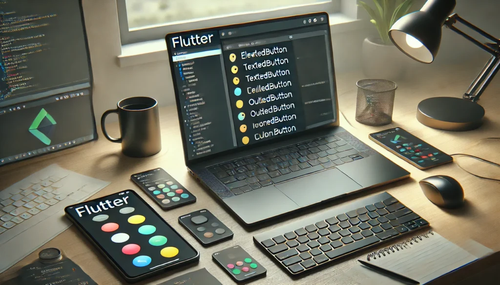
1. Types of Buttons in Flutter
Flutter offers several button widgets, each serving different purposes:
1.1 ElevatedButton
- A button with a shadow (elevation) for emphasis.
- Commonly used for primary actions.
ElevatedButton(
  onPressed: () {
    print('ElevatedButton clicked');
  },
  child: Text('Click Me'),
)
1.2 TextButton
- A simple text-based button without elevation.
- Suitable for secondary actions.
TextButton(
  onPressed: () {
    print('TextButton clicked');
  },
  child: Text('Click Here'),
)
1.3 OutlinedButton
- A button with an outline but no background.
- Ideal for actions that require less emphasis.
OutlinedButton(
  onPressed: () {
    print('OutlinedButton clicked');
  },
  child: Text('Tap Me'),
)
1.4 IconButton
- A button that displays an icon instead of text.
- Used for toolbar actions like back or menu buttons.
IconButton(
  onPressed: () {
    print('IconButton clicked');
  },
  icon: Icon(Icons.favorite),
)
1.5 FloatingActionButton (FAB)
- A circular button used for prominent actions.
- Often used for adding new content.
FloatingActionButton(
  onPressed: () {
    print('FAB clicked');
  },
  child: Icon(Icons.add),
)
2. Customizing Buttons
You can customize Flutter buttons using properties like:
- Style:
style: ElevatedButton.styleFrom(...) - Color:
backgroundColor, foregroundColor - Size:
minimumSize, padding - Shape:
shape: RoundedRectangleBorder(...)
Example:
ElevatedButton(
  style: ElevatedButton.styleFrom(
    backgroundColor: Colors.blue,
    foregroundColor: Colors.white,
    padding: EdgeInsets.symmetric(horizontal: 20, vertical: 10),
    shape: RoundedRectangleBorder(
      borderRadius: BorderRadius.circular(10),
    ),
  ),
  onPressed: () {
    print('Custom button clicked');
  },
  child: Text('Custom Button'),
)
3. Button Click Events
To handle button clicks, use the onPressed callback:
ElevatedButton(
  onPressed: () {
    print('Button clicked');
  },
  child: Text('Click Me'),
)
To disable a button, set onPressed: null.
ElevatedButton(
  onPressed: null,
  child: Text('Disabled Button'),
)
4. Best Practices for Using Buttons in Flutter
- Use ElevatedButton for primary actions (e.g., Submit, Confirm).
- Use TextButton for less important actions (e.g., Cancel, Learn More).
- Use FloatingActionButton for key interactions (e.g., Adding a new item).
- Customize buttons to match the app’s theme for consistency.
- Ensure button accessibility (large tap areas and readable labels).
Conclusion
Flutter provides a variety of buttons for different use cases. By choosing the right button type and applying proper customization, you can improve the user experience in your app. Start implementing these buttons in your Flutter projects today!
Thanks you for reaching out us. You can comment for any query. Please share with your friend also and for more such tutorial you can look here.

La nostra piattaforma permette l’assunzione di lavoratori per incarichi rischiosi.
Chi cerca aiuto possono ingaggiare esperti affidabili per missioni singole.
Gli operatori proposti vengono verificati con attenzione.
sonsofanarchy-italia.com
Attraverso il portale è possibile leggere recensioni prima di procedere.
La qualità continua a essere al centro del nostro servizio.
Esplorate le offerte oggi stesso per ottenere aiuto specializzato!
This tutorial is quite insightful for anyone diving into Flutter! I appreciate how it breaks down the different button types and their uses. Customization options seem really flexible, which is great for tailoring the user experience. I’m curious, though—are there any limitations or common pitfalls when using certain button widgets? Also, how do Flutter buttons compare to those in other frameworks like React Native? I’d love to hear more about real-world examples or your personal experience with implementing them. What’s your favorite button widget in Flutter, and why? Looking forward to your thoughts!
Great tutorial on Flutter buttons! I really liked how you explained their importance in enhancing user interaction. It’s cool to see how customizable Flutter buttons are with their properties. I’m curious, though, how do you decide which button type to use in a specific scenario? Also, are there any common mistakes beginners make when implementing buttons? Overall, this guide is super helpful, and I’m excited to try this out in my projects. What’s your favorite button widget in Flutter, and why? Let me know!
This tutorial on Flutter buttons is quite informative and straightforward. I find it helpful that it covers the basics of button types and their customization. However, I wish it included more advanced examples or use cases to better understand their practical applications. The section on best practices is useful, but it feels a bit brief—could you elaborate more on that? Do you think the choice of button type significantly impacts the overall user experience? I’m curious to know if there are any common pitfalls to avoid when using these buttons in a real-world project. Overall, it’s a great starting point for beginners, but I’d love to see more depth in future updates. What are your thoughts on this?
Great tutorial! I really liked how you explained the different types of buttons in Flutter and their use cases. It’s always helpful to have a clear guide on customization options, especially for beginners. I’m curious, though—do you have any specific examples of real-world apps that effectively use these buttons? Also, what are the most common mistakes you’ve seen when implementing buttons in Flutter? I feel like choosing the right button type can really make or break the user experience. Would love to hear more about your thoughts on best practices for button interactions. By the way, do you think there’s a particular button type that’s underrated or often overlooked? Excited to try these out in my next project!
Hi! This tutorial is quite informative and well-structured. I found the explanation about different button types in Flutter very useful, especially for beginners. The examples provided make it easier to understand how to implement and customize these buttons. However, I’m curious about how to handle button states like loading or disabled states in Flutter. Could you elaborate on that? Also, do you have any tips for optimizing button performance in large-scale apps? Overall, great job on the tutorial—it’s a solid starting point for anyone diving into Flutter development!
Hi, this is a very helpful tutorial on Flutter buttons! Learning to customize buttons is essential for creating user-friendly apps. I found the part about different button types and their use cases particularly interesting. Do you have any tips for choosing the right button type for complex UI designs? Also, could you elaborate on the best practices for button implementation? I think this guide is a great starting point for beginners. Do you have any examples where using a specific button type significantly improved app functionality? Looking forward to experimenting with these button widgets in my projects!
Great tutorial on Flutter buttons! It’s really helpful to see all the different button types and their uses laid out so clearly. I love how Flutter allows for such customization, it really makes app development more flexible. Have you found any particular button type to be more effective in certain scenarios? I’m curious about the best practices for button placement and sizing—any tips on that? Also, do you think Flutter’s button widgets are more intuitive compared to other frameworks? Looking forward to experimenting with these in my own projects. What’s your favorite Flutter button widget to work with? Would love to hear your thoughts and experiences!
Interesting tutorial! Flutter buttons seem quite versatile and essential for enhancing user interaction. I appreciate how you’ve explained the different types and their purposes—it makes it easier to decide which one to use in specific scenarios. The customization options are a great touch, as they allow for more personalized and intuitive designs. I’m curious, though, how do you handle button responsiveness across different screen sizes? Also, are there any common pitfalls to avoid when implementing buttons in Flutter? I’d love to hear your thoughts on how to ensure consistency in button behavior across platforms. What’s your favorite button widget to work with, and why?
### Flutter Button Tutorial: Enhancing User Interaction in Flutter
In this tutorial, we’ll dive into the world of buttons in Flutter. Flutter provides a range of buttons designed to enhance user interaction, making it easier for users to trigger actions, submit forms, and navigate through apps. This guide will teach you about different button types in Flutter, how to use them, and best practices for implementation.
#### Why Buttons Are Important
Buttons play a crucial role in app interaction. They help users complete actions like submitting forms, navigating to different screens, and interacting with the app. Choosing the right button type and customizing it effectively can significantly improve the user experience.
#### Types of Flutter Buttons
Flutter offers several button widgets, each serving different purposes:
– **TextButton**: A simple button with text. Ideal for less important actions.
– **ElevatedButton**: A raised button with a shadow effect. Suitable for primary actions.
– **OutlinedButton**: A button with a border and no background. Perfect for secondary actions.
– **IconButton**: A button with an icon. Useful for actions like deleting or sharing.
– **FloatingActionButton**: A floating button for promoting an action. Often used in the center of app screens.
– **GestureButton**: A button that recognizes gestures like long presses and double taps.
#### Customizing Flutter Buttons
You can customize Flutter buttons using properties like:
– **Text**: Set the text displayed on the button.
– **Icon**: Add an icon to the button.
– **Color**: Change the button’s color.
– **Shape**: Define the shape of the button (e.g., rounded or rectangular).
– **Size**: Adjust the button’s size.
– **Style**: Modify the appearance of the button (e.g., text size, font, etc).
#### Example: Customizing a Button
“`dart
TextButton(
onPressed: () {
// Action when pressed
},
child: Text(‘Submit’),
style: TextButton.style(
color: Colors.white,
backgroundColor: Colors.red,
),
);
“`
#### Relative Layout in Android: A Complete Guide for Beginners (2025)
Learning about buttons in Flutter is just one step in mastering app development. If you’re interested in Android, consider exploring relative layouts in Android, which provide a powerful way to arrange UI components.
#### React Native FlatList: A Complete Guide To Creating the List
For those working with React Native, understanding flat lists is essential. FlatLists are perfect for displaying large lists of data efficiently.
#### Conclusion
Flutter provides a variety of buttons for different use cases. By choosing the right button type and applying proper customization, you can improve the user experience in your app. Start implementing these buttons in your Flutter projects today!
© 2025 fluttertpoints.com
“`
Interesting tutorial! I’ve been working with Flutter for a while, but I still find the variety of buttons a bit overwhelming. It’s great to see a guide that breaks down the different types and their uses. I especially liked the part about customization—it’s something I’ve been meaning to explore more. Do you have any tips for choosing the right button type for complex UIs? Also, how do you handle button states like loading or disabled in Flutter? I’d love to hear your thoughts on best practices for that. Overall, this is a solid introduction, but I think a deeper dive into advanced use cases would be super helpful. What do you think?
Great tutorial on Flutter buttons! I found the explanation of different button types very helpful. Customizing buttons with properties seems straightforward, but I wonder if there are any common pitfalls to avoid. The examples provided are clear, but could you share more advanced use cases? I’m curious about how to handle button states like loading or disabled. Overall, this guide is a solid starting point for anyone working with Flutter. Do you have any tips for optimizing button performance in large apps?