In this tutorial we will learn about the Widgets into Flutter. Widgets are building blocks used to make UI and designs into flutter applications. Flutter uses material toolkit to make the building blocks.

Introduction
Flutter is a UI toolkit developed by Google that allows developers to create beautiful, high-performance, and cross-platform applications. The core building blocks of any Flutter application are Widgets.
Widgets are everything in Flutter – from a simple button to an entire screen layout, everything is a widget. In this guide, we will explore what widgets are, their types, how they work, and how to use them effectively in your Flutter applications.
What is a Widget in Flutter?
A widget in Flutter is a building block of the UI that defines the structure, look, and behavior of an app. It can represent a visual element (like a button or text), layout structure (like rows and columns), or even functional behavior (like animations and gestures).
Key Features of Flutter Widgets
✅ Everything is a Widget – From text, buttons, images to complete screens.
✅ Composable UI – Widgets can be nested within other widgets to create complex UIs.
✅ Fast Rendering – Flutter uses the Skia graphics engine for smooth UI performance.
✅ Customizable & Flexible – Easily modify widgets to create unique designs.
✅ Supports Stateless & Stateful Widgets – Efficient management of UI state.
Types of Widgets in Flutter
Flutter provides a rich set of widgets categorized mainly into Stateless and Stateful.
1. Stateless Widgets
A Stateless Widget is a widget that does not change once it is built. It is immutable, meaning its properties cannot be updated after initialization.
Example of a Stateless Widget:
import 'package:flutter/material.dart';

void main() {
  runApp(MyApp());
}

class MyApp extends StatelessWidget {
  @override
  Widget build(BuildContext context) {
    return MaterialApp(
      home: Scaffold(
        appBar: AppBar(title: Text("Stateless Widget Example")),
        body: Center(child: Text("Hello, Flutter!")),
      ),
    );
  }
}
2. Stateful Widgets
A Stateful Widget is a widget that can change dynamically over time. It has a mutable state that can be updated based on user interactions.
Example of a Stateful Widget:
import 'package:flutter/material.dart';

void main() {
  runApp(MyApp());
}

class MyApp extends StatefulWidget {
  @override
  _MyAppState createState() => _MyAppState();
}

class _MyAppState extends State<MyApp> {
  int _counter = 0;

  void _incrementCounter() {
    setState(() {
      _counter++;
    });
  }

  @override
  Widget build(BuildContext context) {
    return MaterialApp(
      home: Scaffold(
        appBar: AppBar(title: Text("Stateful Widget Example")),
        body: Center(
          child: Column(
            mainAxisAlignment: MainAxisAlignment.center,
            children: [
              Text("Counter: $_counter"),
              ElevatedButton(
                onPressed: _incrementCounter,
                child: Text("Increment"),
              ),
            ],
          ),
        ),
      ),
    );
  }
}
Commonly Used Widgets in Flutter
Flutter provides a wide range of pre-built widgets that help developers build stunning applications efficiently. Here are some of the most commonly used widgets:
Basic Widgets
| Widget | Description |
|---|---|
| Text | Displays a string of text. |
| Image | Displays an image from assets, network, or memory. |
| Icon | Renders an icon from the Flutter Icons library. |
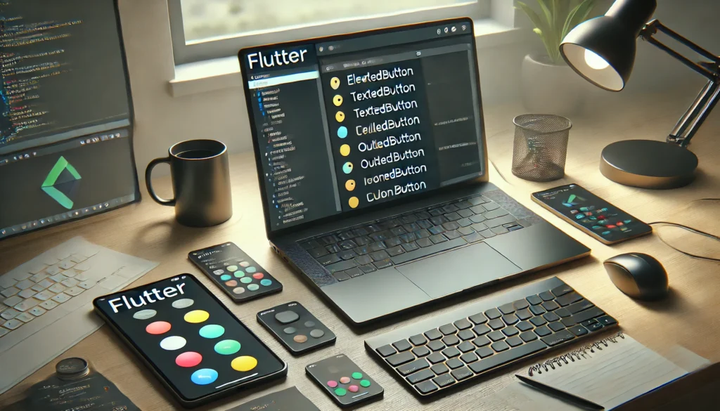
| Button (ElevatedButton, TextButton, IconButton) | Interactive buttons for user actions. |
| Scaffold | Provides a layout structure with AppBar, Body, Floating Action Button, etc. |
| Container | A flexible box for padding, alignment, decoration, etc. |
Layout Widgets
| Widget | Description |
| Row & Column | Arrange widgets in horizontal and vertical direction. |
| Stack | Overlays widgets on top of each other. |
| ListView | Displays a scrollable list of widgets. |
| GridView | Displays widgets in a grid format. |
User Interaction Widgets
| Widget | Description |
| GestureDetector | Detects gestures like taps, swipes, and pinches. |
| TextField | Allows user input like forms and text boxes. |
| Slider | Enables value selection using a sliding scale. |
| Switch | A toggle switch for on/off states. |
How to Use Widgets in Flutter?
Using widgets is simple. Here’s an example of combining multiple widgets into a single UI layout:
import 'package:flutter/material.dart';

void main() {
  runApp(MyApp());
}

class MyApp extends StatelessWidget {
  @override
  Widget build(BuildContext context) {
    return MaterialApp(
      home: Scaffold(
        appBar: AppBar(title: Text("Flutter Widgets Example")),
        body: Center(
          child: Column(
            mainAxisAlignment: MainAxisAlignment.center,
            children: [
              Text("Welcome to Flutter!", style: TextStyle(fontSize: 24, fontWeight: FontWeight.bold)),
              SizedBox(height: 20),
              ElevatedButton(
                onPressed: () {},
                child: Text("Click Me"),
              ),
            ],
          ),
        ),
      ),
    );
  }
}
FAQs About Flutter Widgets
1. What is the difference between Stateless and Stateful Widgets?
A Stateless Widget does not change its state after being built, while a Stateful Widget can be updated dynamically based on user interactions.
2. Can I create custom widgets in Flutter?
Yes! You can create reusable custom widgets by extending StatelessWidget or StatefulWidget classes.
3. What are some must-know widgets for Flutter beginners?
Beginners should start with Text, Image, Row, Column, Container, ListView, and Scaffold widgets.
4. How do I handle user interaction with widgets?
Use GestureDetector, Buttons, and TextFields to capture user interactions in Flutter.
Conclusion
Widgets are the foundation of every Flutter app, making UI development highly flexible and customizable. By mastering widgets, you can create powerful and visually appealing applications with ease.
Start building your Flutter app today and explore the full potential of widgets! 🚀

Pingback: TextFormField in Flutter: A Complete Guide (2025) – fluttertpoints.com